
When homeowners begin designing or renovating a lake house, paint color is often one of the first things they want to choose.
I think it should be one of the last.
A successful lake house color palette isn’t a collection of paint colors. It’s a whole-home color story—one that considers the architecture, natural light, views, flooring, stone, wood tones, metals, furnishings and the way you want the home to feel.
When those decisions are made together, a lake house feels cohesive and intentional.
When they’re made one room at a time, even beautiful individual choices can leave a home feeling disconnected.
As an interior designer and Certified Psychological Color Expert, I approach color as part of the foundation of a home rather than something added at the end.
And when I’m designing a home on the water, there’s another important consideration:
The landscape outside the windows is already part of the palette.
Don’t Start With Lake House Paint Colors
It’s tempting to begin a project by asking, What should we paint the walls?
Before I choose paint, I want to understand what the house has already given us.
I look at the flooring. The wood species. The fireplace stone. Countertops. Cabinetry. Tile. Window frames. Metal finishes. Architectural details. And, of course, the view.
These are the elements that either can’t easily change or will represent a significant investment to change.
They should help establish the palette.
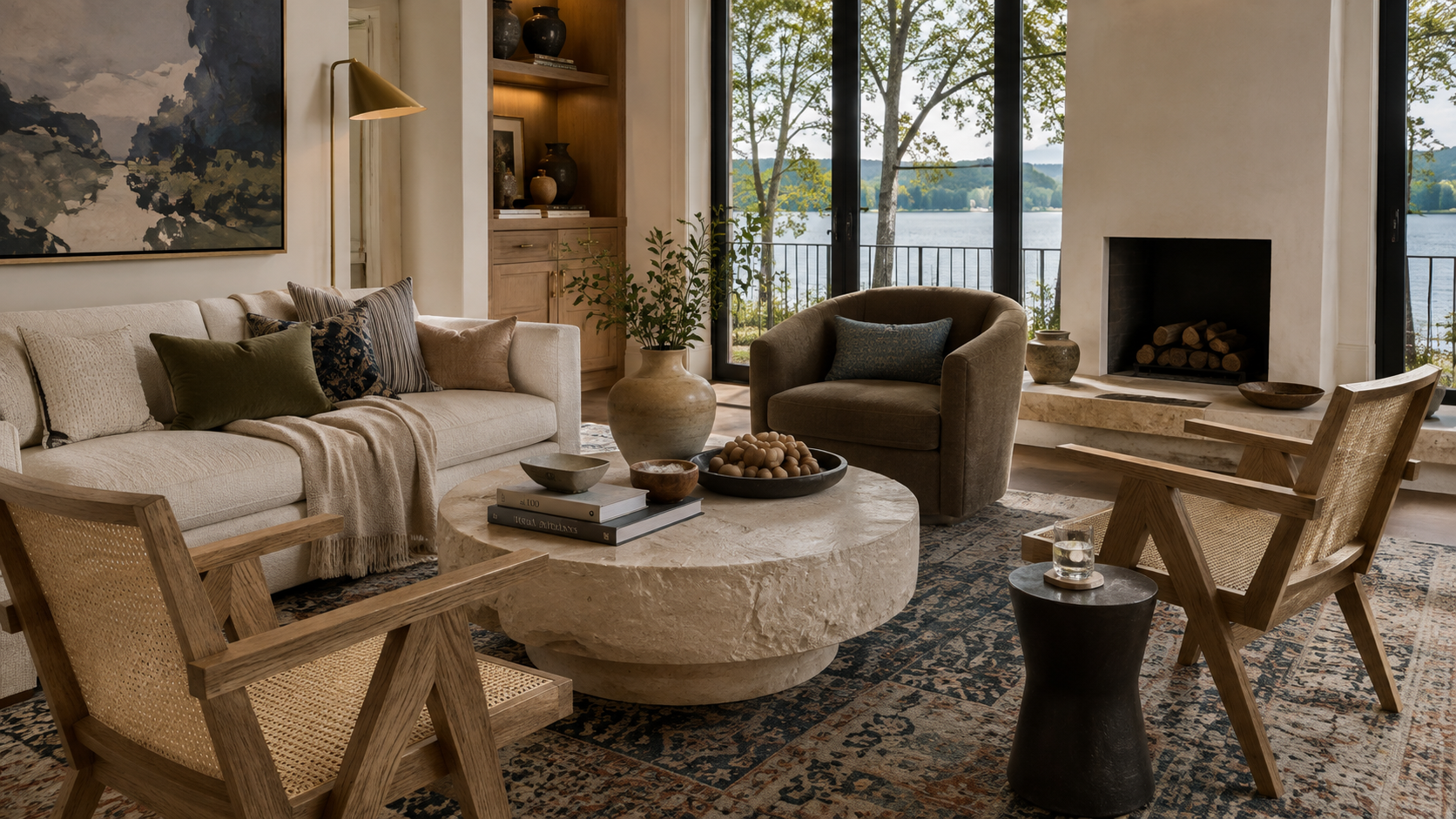
For example, a house with warm white oak, creamy limestone and aged brass is already telling us something about its color direction. Introducing a cool gray simply because it’s a popular paint color can create tension between the finishes.
The paint itself might be beautiful.
It just may not be beautiful in that house.
That’s an important distinction.
Let the Lake Become Part of the Color Story
One of the things that makes designing a lake house different from designing many other homes is the relationship between the interior and the landscape.
The water isn’t just something you see through the window.
It affects what you see inside the room.
Large expanses of glass can bring reflected blues, greens and changing light into an interior throughout the day. Trees surrounding the house can cast green undertones. The color of the sky and water changes with the weather and season.
Even the same wall color can look very different at 8:00 in the morning than it does at 5:00 in the afternoon.
This is why I never recommend selecting lake house paint colors from a tiny swatch—or because you loved a color in someone else’s home.
Sample it in your own house.
Look at it beside your flooring and stone.
Look at it from the adjoining room.
Look at it when the sun is bright and when the sky is overcast.
And absolutely look at it at night under your artificial lighting.
Light is part of the color.
At the lake, so is the view.
Begin With the Materials You Can’t Easily Change
A cohesive palette usually begins with the home’s fixed materials.
Think about:
- flooring and wood tones
- stone and masonry
- countertops
- cabinetry
- tile
- window and door finishes
- architectural metals
Instead of selecting each independently, look for the relationship between them.
If your stone contains warm cream, taupe and subtle gray, for example, those undertones can begin informing other decisions throughout the house.
If your floors are a beautiful medium-toned oak, I don’t want to ignore that warmth when selecting cabinetry or wall color.
This doesn’t mean everything needs to match.
In fact, it shouldn’t.
The goal is coordination, not matching.
A sophisticated interior has variation, but the materials still speak the same visual language.
Build a Whole-Home Lake House Color Palette
This is where I see many lake houses go off course.
One room gets renovated.
Then another.
A new sofa arrives.
Someone falls in love with a wallpaper.
The kitchen gets updated a few years later.
Each decision makes sense on its own, but eventually the house begins to feel like a series of individual projects rather than one complete home.
Before choosing colors for individual rooms, establish a whole-home palette.
I generally like to think about several layers:
A dominant neutral.
This becomes the quiet foundation that allows architecture, materials and views to take center stage.
Natural material tones.
Your wood and stone aren’t separate from your color palette. They are colors.
One or two supporting colors.
These might come from the landscape—muted blue, smoky blue-gray, olive, moss or another softened natural tone.
Contrast.
Charcoal, black, deep bronze or another dark element can provide structure and prevent a light neutral home from feeling washed out.
Warmth.
Leather, wood, woven fibers and warm metals such as aged or brushed brass can keep the palette inviting.
The exact formula will change from house to house.
What’s important is establishing the language before designing each individual room.
The Best Lake House Neutrals Aren’t Necessarily White
Neutral interiors are often described as if they’re simple.
They’re not.
White, cream, ivory, beige, taupe, mushroom and greige all contain undertones, and those undertones determine how well a color works with the rest of the house.
A white with a cool blue undertone can behave very differently beside warm oak than a soft ivory.
A beige with a pink undertone may fight a stone containing yellow or green.
A greige can appear warm in one room and unexpectedly cool in another.
For many of the lake homes I design, I’m drawn to nuanced, warmer neutrals because they work beautifully with natural wood, stone, linen, leather and woven textures.
They also create a softer backdrop for the landscape.
I don’t want the walls competing with the lake.
I want them framing it.
Yes, You Can Use Blue—Just Don’t Theme the House Around It
There’s nothing wrong with blue in a lake house.
There’s something wrong with assuming a lake house has to be blue.
The lake already tells us we’re at the lake.
We don’t need every fabric, pillow and accessory repeating the message.
Instead, I prefer a more restrained approach.
A smoky blue-gray on upholstery.
A muted lake blue woven into a textile.
A piece of art that quietly pulls color from the water.
A subtle blue in a bedroom where we want a more restful feeling.
The same principle applies to green.
Muted olive, moss and smoky green can create a beautiful connection to the surrounding landscape without feeling literal.
Rather than copying nature, I prefer to interpret it.
That’s often the difference between a sophisticated lake house and one that begins to feel themed.
Color Should Support How You Want to Feel at the Lake
Color isn’t only visual.
It also affects the emotional experience of a space, which is one reason my training in psychological color is so useful when I’m developing an interior palette.
Before I ask a client what color they want, I’m interested in another question:
How do you want your lake house to feel?
For most families, the lake house serves a different purpose than their primary residence.
It’s where they exhale.
It’s where the kids and grandchildren come.
It’s where friends gather.
It’s where mornings may begin slowly and a quiet weekend can suddenly become a house full of people.
The words I hear tend to be things like:
relaxed, welcoming, comfortable, peaceful, warm, connected.
Those words should influence the design.
Soft natural neutrals can create visual calm.
Muted blues can feel restful.
Earthy greens can reinforce our connection to the natural environment.
Warm woods and organic textures can create a sense of grounding.
Darker tones can add intimacy and structure.
Color becomes much more useful when we stop asking only:
What color do I like?
And start asking:
How do I want to feel when I’m here?
Undertones Matter More Than Most People Realize
Have you ever walked into a room where nothing is obviously wrong, but somehow it just doesn’t feel right?
Often, the culprit is undertones.
Every neutral has them.
So do woods.
So does stone.
A beige might lean pink, yellow, green or gray. A white can be warm, cool, creamy or slightly gray. Natural stone can contain multiple undertones within a single slab or piece.
If you select each finish independently, those undertones can begin fighting one another.
This becomes particularly important in open-concept lake homes.
Standing in the living room, you may be able to see the kitchen cabinetry, countertops, flooring, fireplace stone, dining furniture and the lake simultaneously.
That’s not six separate color decisions.
It’s one sightline.
When I evaluate a palette, I’m thinking about what the eye experiences together.
Give Every Room Personality Without Starting Over
Creating a whole-home palette does not mean painting every room the same color.
Cohesion and sameness are very different things.
Once the overall palette is established, individual rooms can shift in mood.
The main living areas might stay light and quiet because the lake view deserves the attention.
A bedroom can become softer and more enveloping.
A powder room can be dramatic.
A bar or entertaining space might carry richer woods and deeper tones.
A guest room could introduce more of a supporting color.
What connects the rooms are the subtle repetitions.
The brass used in the kitchen might reappear in lighting elsewhere.
An olive textile in the living room might show up again in a bedroom.
The color found in the fireplace stone might become the neutral used down the hall.
Black window frames might be echoed in furniture or lighting.
Those repeated elements allow the eye to move comfortably from one space to another.
Common Lake House Color Palette Mistakes
If you’re developing your own palette, these are some of the mistakes I would avoid.
Choosing paint first.
Start with the architecture and fixed materials. Paint is one of the easiest elements to adjust later.
Designing one room at a time.
You can design rooms individually only after you’ve established the larger story.
Ignoring the view.
The colors outside your windows affect the colors inside your house.
Choosing colors from photographs.
A color that looks beautiful online may behave completely differently in your light and beside your materials.
Ignoring undertones.
If your whites, woods, stone and neutrals aren’t relating to one another, adding more décor won’t solve the problem.
Using too much blue because it’s a lake house.
Allow the water to be the strongest lake reference.
Following a trend instead of listening to the house.
The architecture should always have a voice in the palette.
A Designer’s Formula for Building a Lake House Color Palette
If you’re not sure where to begin, this is the order I recommend:
1. Architecture
Start with the house itself—its style, scale, architectural details and relationship to the landscape.
2. Natural light and views
Study the direction of the light, the water, surrounding trees and the colors reflected into the interior.
3. Fixed materials
Identify the undertones in flooring, stone, cabinetry, countertops and other permanent finishes.
4. Dominant neutral
Choose the neutral foundation that best relates to those materials.
5. Supporting colors
Introduce a restrained selection of colors that complement both the interior materials and surrounding landscape.
6. Contrast
Add enough depth through charcoal, black, bronze, deeper wood or another dark tone to give the palette structure.
7. Finishing materials
Layer metals, textiles, leather, woven fibers and other materials that bring warmth and dimension to the palette.
8. Paint
Now choose the individual paint colors.
When you make these decisions in the right order, paint becomes considerably easier to select.
More importantly, you’re no longer simply choosing colors.
You’re designing a home.
A Beautiful Lake House Should Feel Connected
The most successful lake houses aren’t the ones with the most dramatic color palettes.
They’re the ones where the architecture, landscape, materials, furnishings and colors seem to belong together naturally.
You may not walk into the room and immediately identify why it works.
You simply know that it does.
That’s what a thoughtful lake house color palette can accomplish.
It gives individual rooms personality while allowing the entire home to feel like one complete idea.
And it’s part of a larger principle I use throughout my work:
Make the right design decisions in the right order.
If your lake house has been updated one room, one purchase or one project at a time and you’re ready to create a more intentional plan, I created The Lake House Reset, a complimentary design guide to help you determine where to begin.